Looking for an efficient way to convert your images to WebP and…
You’ve optimized your images for desktop, but also want to be on top of how to optimize images for mobile? You’re right to think about it. Images are often the main culprit behind a slow-loading site on smartphones.
According to the HTTP Archive, in 2024, JavaScript was the most requested file type on the web, but images came right after, still accounting for a significant portion of a web page’s total weight. This proves that images deserve just as much attention and should be optimized for every type of device as part of a multi-device optimization strategy.
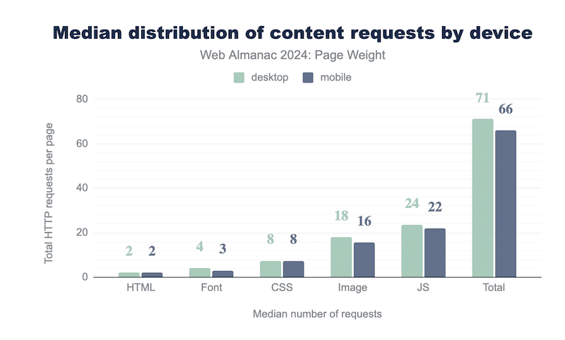
Don’t forget that mobile devices have smaller screens, limited processing power, and often rely on slower connections. That’s why your desktop strategy won’t cut it here. You need a dedicated approach to serving mobile-friendly images that load fast, look great, and support your image SEO goals.
In this guide, we’ll explain exactly how to optimize images for mobile (including Android and iOS apps), from sizing and compressing to modern formats and smart delivery options.
| 🎯 TL;DR: Optimizing images for mobile is essential to improve load speed, enhance user experience, and boost image SEO for mobile. To achieve effective mobile image optimization, images should be resized appropriately for smaller screens, compressed using mobile image compression tools, and converted into next-gen image formats for mobile, like WebP or AVIF. Serving responsive images ensures the right image size is delivered based on the device, avoiding unnecessary file weight. Lazy loading images on mobile and using an image CDN for mobile delivery also help reduce load times and save bandwidth. Regular audits using tools like GTmetrix and PageSpeed Insights can help track image file size reduction, optimize mobile image size, and improve Core Web Vitals. Ultimately, balancing image quality vs performance across devices leads to faster pages, higher search rankings, and better conversion rates on mobile. Key takeaways ✅ Compress images to reduce file size without losing quality. ✅ Choose next-gen formats like WebP or AVIF for faster loading on mobile. ✅ Use srcset and sizes for responsive images that adapt to mobile screen widths. ✅ Use Imagify for compression, resizing, WebP/AVIF conversion. ✅ Enable lazy loading so images load only when users scroll to them. ✅ Serve images via a CDN to boost speed on different devices and networks. ✅ Always add descriptive alt text for accessibility and mobile SEO ✅ For mobile apps: apply the same optimization principles, but load images dynamically via API from an external server/CDN to avoid heavy apps. ✅ Run PageSpeed Insights or GTmetrix tests regularly to monitor mobile performance. ✅ Regular audits help keep your site fast and smooth for mobile users. |
How to Optimize and Load Smaller Images for Mobile Devices
The best strategies to conduct image optimization for mobile include serving images at the screen size, using next-gen formats, compressing images, applying lazy loading, and relying on an image CDN.
Let’s explore how to deliver mobile-friendly images that look great and load fast.
Resize Images to Fit the Screen, Not Less, Not More
When it comes to mobile image size, bigger isn’t better. Serving a 4000px-wide image to a screen that’s only 375px wide wastes bandwidth and slows your page down. Mobile users expect lightning-fast loading, and unnecessary pixels are your enemy.
Instead, deliver responsive images for mobile that adapt to the screen size. Modern websites use the srcset and sizes HTML attributes to serve different image resolutions based on the device. This is essential for mobile image delivery optimization.
✅ Best practice: For most mobile devices, aim for image widths between 320px and 720px. A good break-even point is 640px, big enough for clarity, small enough for efficiency.
Take Advantage of Mobile Image Compression
There’s a common myth that compressing images will make them blurry. But with the right tool or plugin, you can compress images in bulk while maintaining visual quality.
Mobile image compression removes unnecessary data from the image file, reducing its weight without altering how it looks to the human eye. This leads to a major reduction in image file size and a smoother experience for users, especially on slower mobile networks.
Convert Images to Next-Gen Formats
Next-gen formats like WebP and AVIF offer much better compression than traditional JPEG or PNG files. These lightweight formats preserve excellent image quality, making them ideal for mobile image optimization.
Google PageSpeed Insights recommends next-gen formats because they help speed up websites.
Lazy Load Images on Mobile
Lazy loading delays the loading of images until they appear in the user’s viewport. This means only the images currently visible on the mobile screen are loaded first, and the rest load as the user scrolls.
This technique significantly reduces the initial load time and saves bandwidth, especially on image-heavy pages. However, it’s important not to lazy load critical images that appear immediately when the page loads. Instead, lazy load the rest to optimize performance without affecting the user experience.
Use an Image CDN on Mobile to Improve Image Delivery
A CDN (Content Delivery Network) is a global server network that stores and serves images from a location closer to the user. This reduces the physical distance your images have to travel, improving load times.
For example, if your images are hosted on a server in London and someone accesses your site from Mexico, a CDN will serve the images from the nearest server in North America instead of routing the request to the UK.
Why Serve Optimized Images for Mobile Devices
There are several key reasons for developing a mobile-focused image optimization strategy. It’s not just about speed; it’s about delivering a better user experience, improving search rankings, and increasing conversions.
For Loading Speed and Performance
Mobile users often face slower connections and limited device power, so optimizing image load speed on mobile is essential. Lightweight, mobile-friendly images make pages faster, reduce bounce rates, and keep users engaged.
In an online video, Adrienne Clem, Director of Search Ads Growth and Optimization at Google say that:
“Great mobile user experience starts with speed. This is your first impression for a prospective customer and signals not just about the quality of the experience of the web page—it’s also the quality of your brand and product.”
For User Experience and SEO
Google uses mobile-first indexing, which means it primarily considers the mobile version of your website for indexing and ranking. That’s why image SEO for mobile is essential: slow-loading or poorly optimized images can directly hurt your visibility in search results.
The Google Page Experience update and Core Web Vitals are also part of this equation. They evaluate how users interact with your site and include key factors like mobile-friendliness, page speed, and visual stability. Your image optimization for mobile — from compression to responsive sizing — has a direct impact on these signals and can help improve both user experience and search rankings.
For Conversion Rate and Revenue
Optimizing mobile images doesn’t just please Google, it drives sales results. Faster load times mean better engagement and higher conversions. In 2024, Shopify reported that accelerating a site on mobile led to more time spent on page and a 20% increase in conversions compared to non-optimized pages. The takeaway? Optimizing images for mobile directly improves revenue opportunities for your business.
How to Measure the Impact of Images on Mobile
Here’s a simple 3-step strategy to evaluate how well your images are optimized for mobile. These personal tips and tools will help you check the current state of your mobile optimization and measure improvements after implementing optimization techniques. Think of it as a before/after diagnosis to make sure your images truly support a fast, mobile-friendly experience.
1. Check KPIs to Evaluate Your Mobile Image Optimization
The first step is to compare specific performance metrics before and after image optimization. These KPIs will help you see if your images are now better suited for mobile devices:
- Image file size: It should be significantly smaller after optimization.
- Overall page weight: A lighter page after optimization means faster load time.
- Image weight ratio: The percentage of image weight vs the total page size should decrease.
✅ Best mobile performance tools to measure those KPIs:
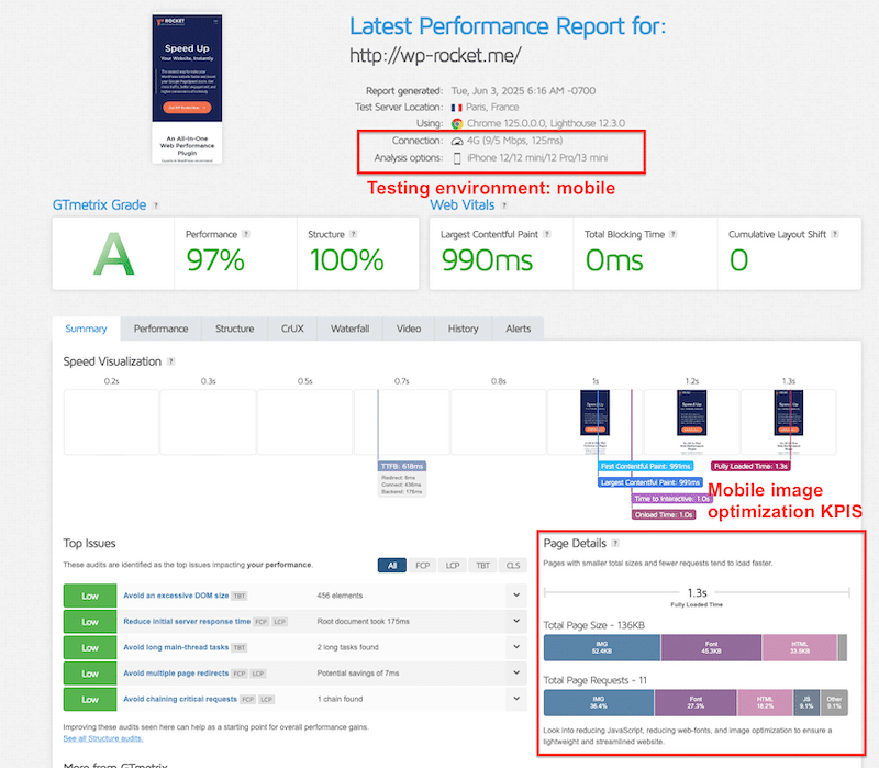
GTmetrix is great for Core Web Vitals and measures page size, image weight, and load speed with detailed waterfall breakdowns. It reports metrics like First Contentful Paint (FCP) and Largest Contentful Paint (LCP).
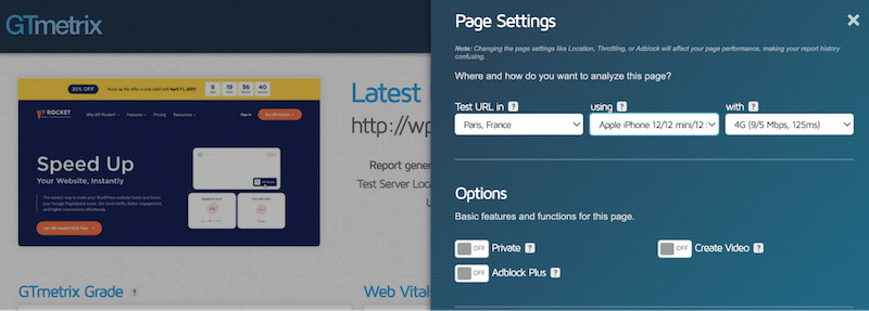
Simply enter your site URL, select the testing environment on mobile, such as network speed and device type:
Then run the test and check the results on mobile, you can see the page details section with some of the KPIs:
WebPageTest offers advanced testing with mobile device emulation and also KPIs like First Contentful Paint (FCP), Largest Contentful Paint (LCP), and image weight percentage. Also useful for identifying what resources (images, scripts, etc.) load first.
| 💡 Technical tip: When testing on both tools, make sure to select a smartphone environment and simulate a 4G connection for accurate mobile performance results. |
2. Run a Mobile Performance Audit
Beyond basic KPIs, a full performance audit helps you understand whether your images meet mobile optimization standards. One key metric to look at is LCP (Largest Contentful Paint), part of the Core Web Vitals. If your LCP element is an image, that image must be optimized.
These tools also flag specific issues like compression, format, sizing, and lazy loading, so you know exactly what to fix.
✅Recommended tools:
PageSpeed Insights (mobile mode) – the diagnostics section tells you what to improve on mobile to boost performance.
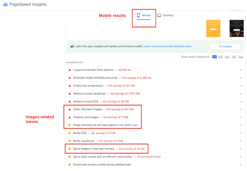
GTmetrix (mobile mode) – it also gives an overview of the top mobile issues that need to be addressed.
Here’s a comparison table you could use for your mobile optimization journey:
| Audit Flag | Before Optimization | After Optimization |
| Efficiently encode images | ❌ Images not compressed | ✅ Images compressed |
| Serve images in next-gen formats | ❌ Using JPEG/PNG | ✅ Using WebP/AVIF |
| Defer offscreen images | ❌ No lazy loading | ✅ Lazy loading enabled |
| Properly size images | ❌ Desktop-sized on mobile | ✅ Mobile-optimized sizes |
| 💡 Technical tip: Always select the mobile tab in PageSpeed Insights and run your audit in an incognito browser window to avoid cached results. |
3. Monitor Mobile Optimization Over Time
Image optimization isn’t a one-time task; it’s part of an ongoing process. Every time you update content, change themes, add plugins, or update WordPress itself, run a quick test to ensure your images still meet mobile performance standards.
| 💡 Hint: Keeping an eye on image performance is key to staying ahead of Google’s speed expectations and delivering a mobile-friendly experience. |
Practical Tips for Mobile Image Optimization with Examples
Image optimization for mobile is a must if you want your website to load fast, look sharp, and pass Google PageSpeed Insights with flying colors. The following are personal tips I use every time I need to prepare images for mobile; they work, and they make a real difference. You’ll also find quick technical tips to speed up your optimization process, along with real examples to help you apply them right away.
Keep the Right Ratio When Resizing
Always make sure to maintain the aspect ratio when resizing images. Distorted images can harm your brand’s credibility and user experience. Use the “lock” or “constrain proportions” feature when adjusting image dimensions.
✅ Recommended tools (from easiest to most advanced):
- Preview (Mac) and Photos (Windows)
- Canva
- Sketch
- Photoshop
Example of image resizing for mobile with Preview (Mac):
- Open your image in Preview
- Go to Tools > Adjust Size
- Input the width and height you want (e.g., 800×600 px)
- Check the box to Scale proportionally
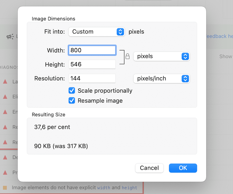
5. Save your image by clicking the OK button.
Serve Responsive Images Based on Screen Size
Responsive images for mobile automatically adapt to different screen sizes, ensuring your site loads the right version for each device.
| 💡 Technical tip: A non-responsive image might load a large desktop version even on a phone. That’s unnecessary data. Instead, use the srcset attribute in your <img> tag to define multiple image sizes. |
Example of a code snippet when serving responsive images on mobile:
❌ Not responsive image:
<img src="my-dog.webp" alt="My dog"> ✅ Responsive image:
<img src="my-dog.webp"

     srcset="my-dog-400.webp 400w, my-dog-800.webp 800w, my-dog-1200.webp 1200w"

     sizes="(max-width: 600px) 400px, (max-width: 900px) 800px, 1200px"

     alt="My dog">
✅ Recommended tool:
If you’re not comfortable with coding, consider using a service like Cloudinary, which dynamically delivers the most efficient image format and size to each visitor.
Compress Images Without Losing Quality
Compression is key to reducing file size, but a common myth is that it always results in blurry images. The truth is, with smart compression tools, you can significantly reduce the weight of your images without compromising visual quality and boost performance.
| 💡 Technical tip: If you’re compressing manually (e.g., with Photoshop), be careful not to overdo it. Use the quality slider conservatively and always preview the result if you have many images to compress, use a plugin that supports bulk compression instead. |
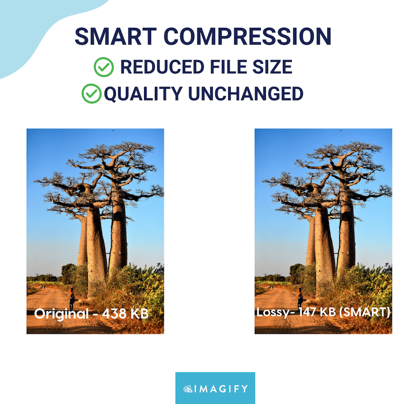
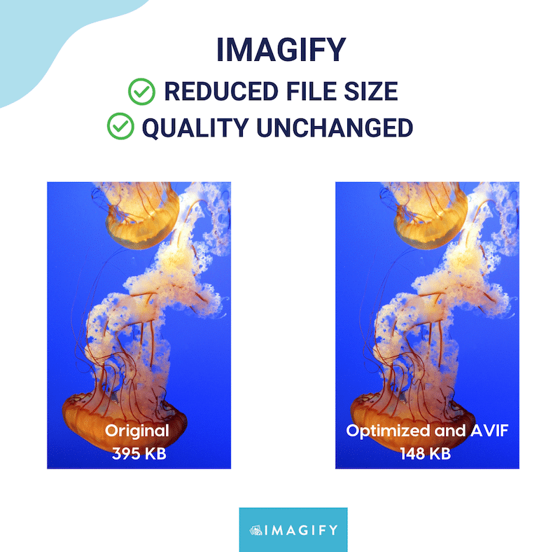
✅ Recommended tool: Imagify is the easiest image optimization plugin, compressing your images with one click. Thanks to Smart Compression, the plugin strikes the perfect balance between reducing file size and preserving visual quality. Here’s an example of Smart compression below:
Convert to WebP and AVIF from Your WordPress Dashboard to Save Time
AVIF and WebP are next-gen image formats that offer better compression than older formats like JPEG or PNG, resulting in faster load times and lower bandwidth usage.
| 💡 Technical tip: Don’t waste time uploading images to external tools and re-importing them to WordPress. Instead, choose a plugin that does the job directly from your dashboard. This approach scales easily when you manage a large number of images. |
✅ Recommended tool: Besides smart compression, Imagify allows you to convert all your images to WebP or AVIF from your WordPress dashboard, no file juggling needed. It’s the fastest way to implement next-gen formats across your entire site and optimize image delivery for mobile users.
Optimizing Mobile Images with Imagify
The simplest way to start image optimization for mobile is to use the Imagify plugin available on the WordPress repository. It’s simple, efficient, and saves you both time and effort. Plus, it’s free for up to 20MB of data per month (around 200 images).
To optimize images for mobile with Imagify, you can follow these four steps:
1. Install the free Imagify plugin and create a free account with an API key.
2. Head to Settings > Imagify and select the next-gen format of your choice (AVIF or WebP).
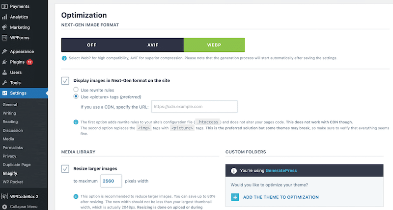
3. Scroll down and click the Save and go to bulk optimizer button to launch the bulk compression. The compression is made using Smart Mode, which provides a significant image file size reduction while preserving visual quality.
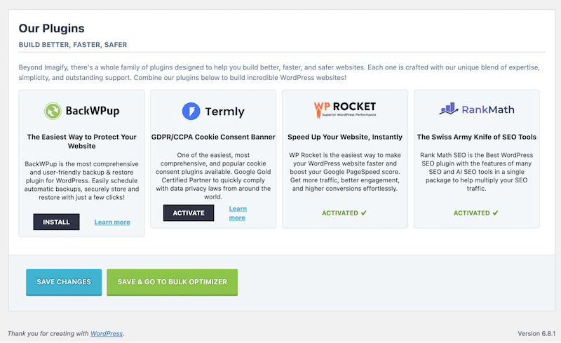
4. Check the results: preserved quality with Imagify.
Bonus: Accessibility Considerations for Mobile Images
Optimizing images for mobile isn’t just about speed and performance, accessibility is part of building a mobile-friendly website or an app. For users with visual impairments or who rely on assistive technology, properly described images help ensure a better browsing experience. It can be done with
Here are five best practices to keep in mind when adding alt text, especially in a mobile context:
1. Describe the Essential Content
For informative images (photos, illustrations, icons with meaning), write a short, meaningful alt text that conveys the image’s purpose. This helps both users and search engines understand your content, supporting image SEO for mobile.
2. Skip Alt-text for Decorative Images
If an image is purely decorative and adds no value (like a background pattern), use alt=””. This avoids unnecessary distractions for screen reader users, especially important on small screens where focus matters more.
3. Use Functional Alt-text for Clickable Images
When using an image as a button or link, describe its function, not what it looks like. For example, use “Submit search” instead of “Magnifying glass icon”. On mobile, where buttons are smaller, this helps users understand their actions clearly.
4. Keep It Short and Relevant
On mobile, less is more. Write concise alt text that communicates the image’s role in a sentence or less. Prioritize key information first, and avoid redundancy like “image of” or “picture showing”.
5. Support Responsive Design
Icons on mobile often lose their text labels due to space. Make sure these icons have descriptive alt text, so mobile users relying on assistive tech still understand them. Also, ensure the icon itself remains clear in smaller sizes.
| 💡Hint: When in doubt, read your alt text aloud and imagine you’re describing the image to someone over the phone. If it helps the listener understand the page better, you’re on the right track! |
Image Optimization for Mobile Apps: 5 Best Practices
Before uploading images to your iOS or Android app, always compress them using an online image optimization tool. Just like on the web, large, unoptimized images can slow down your app, increase memory usage, and negatively affect usability.
Below, we’ll review key practices for ensuring your visuals are sharp, accessible, and don’t slow down mobile device performance.
- Avoid embedding large images directly in your app. Stick to small assets only (like icons, 100×100 px). Including full-size photos or banners directly in the app increases its size and slows down installation and performance.
- Use an API to load images on the user side. This keeps the app lightweight and lets you update visuals without pushing new app versions. The API returns image URLs that point to external storage, and the app loads them on demand.
- Prepare your images before using the API. Whether you host them on your own server (for small projects) or on a CDN (for larger apps), ensure they are properly optimized. Resize images to around 1000 px wide and create multiple versions if you target different screen densities (e.g., 1x, 2x, 3x).
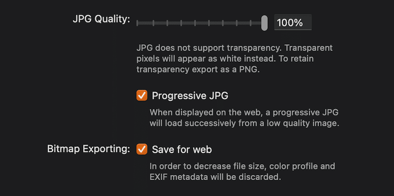
- Compress your images to reduce file size while preserving quality. You can use tools like Imagify’s online compressor, which works independently from the plugin. Design tools like Sketch also allow compression during export and offer the option to export progressive images (these load in stages — a low-res preview appears first, improving perceived speed).
- Choose the right image format. WebP and AVIF are both modern formats that balance quality and size very well and are supported on Android and iOS.
Future Trends in Mobile Image Optimization
Future trends in mobile image optimization may include the rise of AVIF for better compression, smarter AI-powered tools that adapt images to user context, and more advanced lazy loading techniques to improve performance and user experience.
AI-driven advancements are completely reshaping image optimization. We’ll likely see more tools that automatically select the ideal format, resolution, and compression level based on context, such as the user’s device, connection speed, or even content type.
The next-gen formats may then replace JPG and PNG. WebP is already widely supported, but AVIF is quickly gaining traction thanks to its superior compression and excellent quality at lower file sizes. In the near future, AVIF may become the new standard format for mobile image delivery, especially for performance-focused apps and sites targeting slower networks.
FAQs – Mobile Image Optimization
How Do You Optimize an Image for Mobile?
To optimize images for mobile, use a responsive strategy that tells the browser to load the smallest appropriate version for each screen. Start with image resizing for mobile devices, apply mobile image compression to reduce file size, convert to lightweight image formats like WebP or AVIF, and use lazy loading to improve image load speed on mobile by deferring off-screen images.
What Does “Optimize for Mobile” Mean?
Optimizing images for mobile means going beyond desktop strategies and adopting a mobile-first approach. Mobile-friendly images should load fast, be responsive to different screen sizes, and maintain a balance between image quality and performance. For instance, a desktop image that is 1200px wide might only need to be 600px on mobile, reducing the image file size and improving mobile image load speed.
What Is the Optimal Image Size for Mobile?
The ideal mobile image size depends on the layout, but here are general guidelines to support image optimization for mobile:
- Hero images: around 600px wide.
- Banners & blog images: around 800px for tablets, around 480px for smartphones.
- Logos: For vertical layouts, 160 × 160 px is a good minimum. For horizontal layouts, use 250 × 150 px, 350 × 75 px, or 400 × 100 px.
What Is the Best Image Format for Mobile Apps?
For mobile-friendly images, WebP and AVIF are the best image formats for mobile apps. They offer excellent compression while preserving image quality and supporting transparency, and they are compatible with Android and iOS.
Wrapping Up
Optimizing for mobile isn’t the same as optimizing for desktop — smaller screens, slower connections, and different user behavior all come into play. Make sure to resize images for mobile, choose the right formats, and run performance audits simulating mobile environments (like 4G on a smartphone).
The easiest way to get started is to use Imagify. It can bulk compress your images, preserve quality, convert to WebP or AVIF in one click, and instantly speed up your mobile site or app. Try it for free and see it for yourself!


