Looking for an efficient way to convert your images to WebP and…
This is a guest post. Opinions and recommendations are the author’s own.
Your website acts as the welcome mat for your business.
But what happens if visitors come knocking and don’t convert into customers? A common reason may be your website design.
Yes, your website aesthetic may be great, but it’s not the only factor influencing your business’s conversion rates.
Poor user experience, confusing navigation, or slow load times can all turn potential customers away.
By avoiding common design mistakes, you can create a site that looks good and loads fast.
In this post, we’ll help you get more insights into the website design mistakes you might be making. But we won’t leave you there – we’ll also unlock ways to prevent and rectify major design errors and boost your website’s conversion rate immediately. A well-designed site has a 200% higher conversion rate than a poorly designed one.
So, why wait? Let’s dive in and boost your web design and conversions right away!
The Relationship Between Design and Conversion Rates
If you think about it – design is crucial for a website. After all, a website isn’t physical. You can only experience it through its design interface.
So, your site design impacts your website visitor’s behavior significantly.
It’s no wonder that conversion rates and website design are inextricably linked.
When you create a well-designed website, you offer a superior user experience. This means your site is easy to navigate and a pleasure to explore.
And the opposite is also true: if your site is poorly designed, for example, by including too much content or visuals, it can also drive users away. Or, if navigating is confusing, you’ll lose potential customers in a heartbeat. Users will click away from a website after a few seconds of frustration.
Performance matters, too. Websites should load quickly and run smoothly. No one wants to wait around for a page to load. The faster your site, the happier your visitors will be.
A well-designed website also shows that you’ve put in the work and expense to make it what it is. And your audience is more likely to trust it and see your site and content as a trustworthy source.
Finally, design and conversions are linked because good web design supports and elevates great copy. Content has enough power to drive sales on its own, but there’s no question that web design elements can enhance your copy and make sure it’s heard loudly and clearly.
9 Website Design Mistakes Keeping Conversions Down
We hope you’re excited to explore the key mistakes you should avoid on your website.
We’ll look at common but impactful design mistakes that could make your audience exit your site without giving your brand a chance to show what it can do.
1. Not Keeping the User in Mind
One fundamental mistake you might make is not prioritizing your users’ needs during the design process, especially for those businesses aiming for a strong online presence, such as custom clothing retailers or website designers.
This happens more often than you think because it’s easy to slip into a sort of tunnel vision when designing your site. You could get so preoccupied and impassioned with your vision that you fail to incorporate your users’ needs and pain points into your design process.
For instance, you’re running a high-end luxury hot tub business for retail customers. Your primary design focus should be on the lifestyle aspect to engage buyers instead of technical features like the tub’s volume, materials, and other industry details that a wealthy end customer doesn’t care about.
2. Poor Navigation
Imagine entering a physical store where the aisles aren’t marked, and the items are randomly scattered – it’d be a frustrating and dissatisfying experience.
The same principle applies online. A study by three marketing brands found that most users rely on a navigation panel to explore a site, and 37% of people would leave a site if it had bad navigation.
Any website with confusing menus and cluttered layouts can quickly overwhelm and frustrate your users, especially when it concerns essential information, for example, when applying for a job or filling out a vital government form.
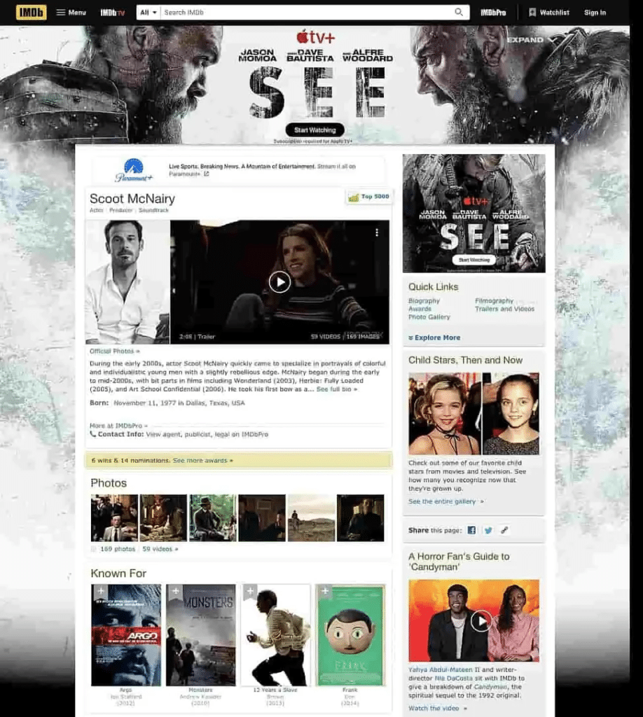
They’ll look elsewhere for easier experiences that meet their needs fast – and you need to fix this issue fast or lose out on conversion opportunities.
Chris Masanto, the CEO and co-founder of PetLab Co., says, “Effective navigation is the silent hero of e-commerce success. At PetLab, we recognized that our site’s navigation was a hurdle in our customer’s journey, impacting our conversion rates. To address this, we innovated with a ‘Shop by Category’ menu positioned strategically below the main menu. This simple yet effective design allows customers to navigate directly to their desired category from the homepage with just one click. This change significantly enhanced user experience and streamlined the path to purchase, leading to a noticeable improvement in our conversion rates. It’s a clear example of how refining navigation can transform a potential website flaw into a powerful tool for business growth.”
3. Not Using Progressive Disclosure
Progressive disclosure means revealing more information or features on a website as users progress through it.
The idea is that presenting too much information at once is overwhelming and makes for poor user experience.
When people feel discomfort from processing too much information at once, they’ll leave your site and likely never return.
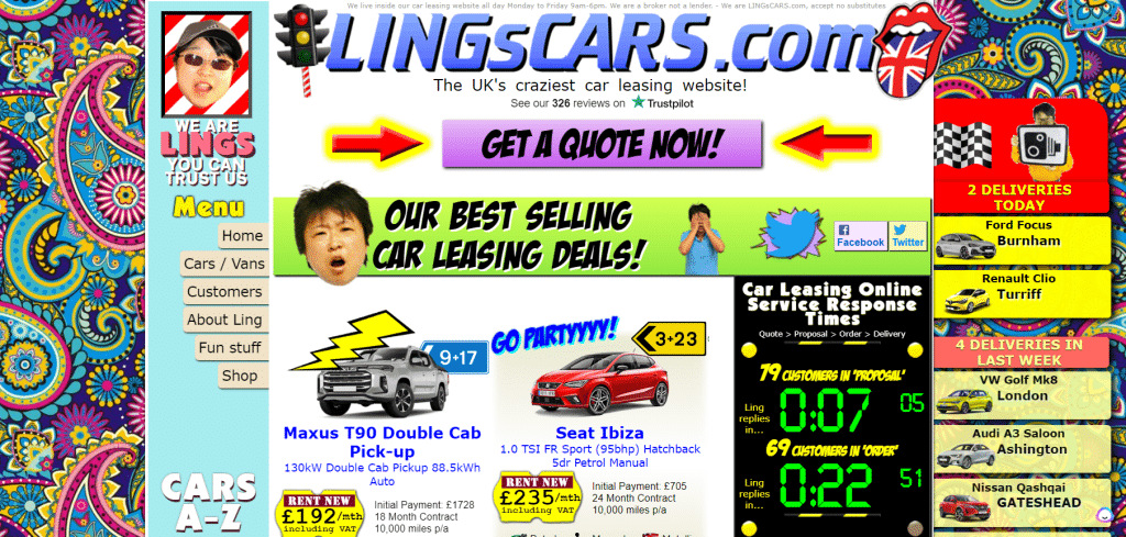
Check out the screenshot above of a colorful and striking website. It has almost no progressive disclosure and reveals all at once.
Visitors get everything, everywhere on the site – and while this makes for a great title for a blockbuster movie, you do not want this for your website.
4. Lack of Mobile Optimization
According to Statista, in the second quarter of 2023, 95.8% of people used the internet via their phones vs. 63% that used their desktops.
You cannot ignore mobile optimization when designing your site.
People are more likely to visit your mobile site over your desktop, so a lack of mobile responsiveness means a definite loss of conversions.
A surprising example is the Yale School of Art website. Neither its desktop site nor the mobile version seems to have entered the 21st century. However, you can see the problems with the site once you visit the mobile site version.

5. Inconsistent Typography
Playing with different fonts can be fun and exciting. Different styles of fonts or typography can convey entirely different messages. For example, a cursive font indicates a product or brand that is casual or home-made.
A heavy-block font might convey seriousness, masculinity, or industrial vibes.
You might be tempted to use different fonts to convey interest, but that’s a big mistake. People who visit your site want information and little else. And if you have more than two or three (maximum) fonts, your audience will leave because they’ll find your content disorientating and confusing, disrupting the overall browsing experience.
6. No Brand Colors
Colors play a big role in branding and creating a visual identity for your website. It’s essential to use consistent brand colors throughout your site instead of random colors that don’t align with your brand image. This helps create a cohesive and professional look, making your website more visually appealing.
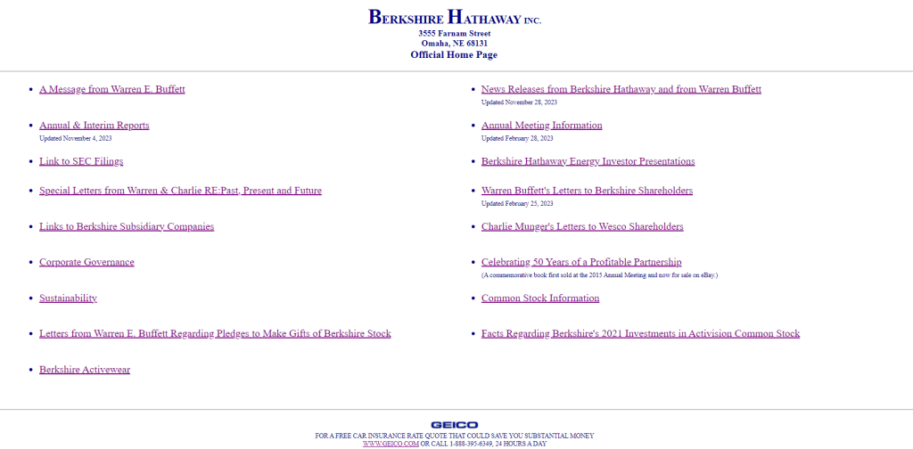
Additionally, having no brand colors can make it difficult for visitors to remember or associate your brand with a specific color, making it harder for them to recall and recognize your website in the future.
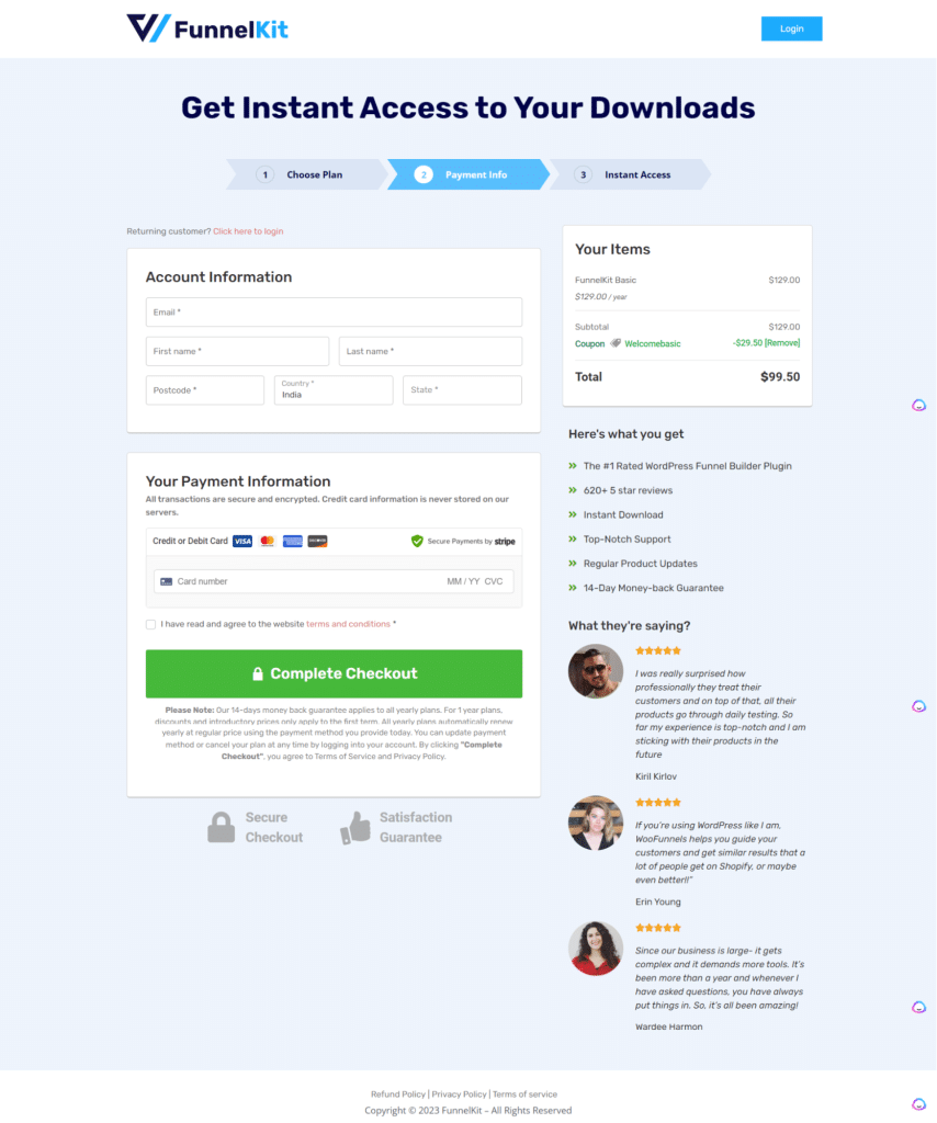
Below is an example of a site that successfully uses a limited color palette everywhere. It has used its brand palette on different elements of its checkout page to create a consistent appearance while emphasizing its checkout button, coupon, progress bar, and more.
7. Not Enough White Space
White space is an essential design element many websites overlook. It refers to the empty areas on a webpage and helps balance out the elements on the page, making it easier for users to navigate and absorb information.
Without enough white space, a website can look cluttered, causing visitors to leave without fully engaging with your content or converting quickly.
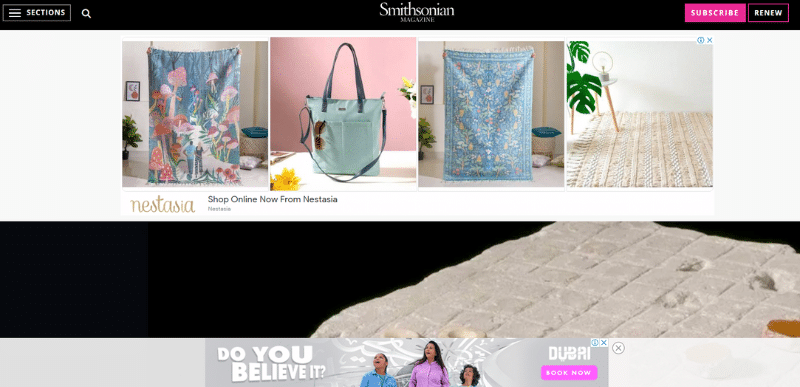
This page by the Smithsonian has no space to breathe. It’s mostly occupied by ads before the user can see the post.
8. Not Focusing on Accessibility
Having a website accessible to all individuals, including those with disabilities, is not a luxury but a necessity.
Accessibility features, such as alternative text for images, transcripts for videos, and color contrast for visually impaired users, should be embedded early on in your design.
Ignoring these standards can potentially exclude a large number of users from fully interacting with your site, leading to a diminished user experience and lower conversion rates.
9. No Clear Calls to Action
A well-designed website will guide users clearly and intuitively toward their next action.
Without clear calls to action, users may struggle to find relevant services or products or may simply close a tab and move on.
Don’t worry about sounding pushy and salesy. If you’ve done a good job of providing value, your audience will expect and respect a call to action, inviting them to convert.
These are some of the top website design mistakes you might make that are driving paying customers away. These small but impactful issues add up and have a disproportionate effect on sign-ups, sales, and more. So, don’t take them for granted.
How to Fix These Website Design Mistakes
To avoid and remedy the web design mistakes mentioned above, it’s essential to take a proactive, user-centric approach throughout the design and development process. Here’s how.
Conduct User Research
This is the foundation. Before you begin designing your website, conduct thorough user research.
This means identifying your target audience and understanding their needs, pain points, demographics, and browsing habits.
Doing user research will inform every aspect of your design, from the layout and navigation to color schemes and typography.
For instance, an eCommerce store targeting millennials might opt for a minimalist design, accessible language, and social media integrations. While a blog for tech enthusiasts will have a more media publication format and won’t hesitate to incorporate jargon and code blocks.
You can do user research in several ways:
- Leveraging and investing in a user-testing platform
- Implementing survey tools to ask for feedback
- Using analytics software for behind-the-scenes data
- Analyzing your customer relationship management tools and so on
A little data can make a phenomenal difference to better website design and conversions, too, so don’t skip it.
Invest in Quality Hosting and Plugins
Some design ‘errors’ appear that way because a site is impacted by performance issues.
For example, when an eCommerce product page fails to load all images or if the headings in a page appear jumbled up – you should look at site load speed as a possible cause.
A website that loads slowly and isn’t optimized for mobile or has too many plugins can be incredibly frustrating for users and lead to high bounce rates and low conversion rates.
Your best bet is to invest in a quality hosting service and use the right plugins to optimize your site images.
To prevent any errors from popping up, you should use two important tools to solve your site loading issues:
- Imagify: This tool is all you need to easily compress images without compromising quality, keeping your pages light and fast to load.
- WP Rocket: This tool is the easiest and most powerful caching solution to speed up your website in a few clicks and optimize Core Web Vitals.
These tools will help you optimize your images and make your pages load faster, ensuring users stay engaged.
Implement Split Testing
Split testing, or A/B testing, involves creating two different versions of a web page and testing them with your user base to see which does better.
There’s often a blindness that happens when you design anything. You lose sight of seemingly obvious issues when you’ve been in the thick of building your site for a long time.
Split testing is essential for optimizing aspects of your website, from landing page layouts to calls to action.
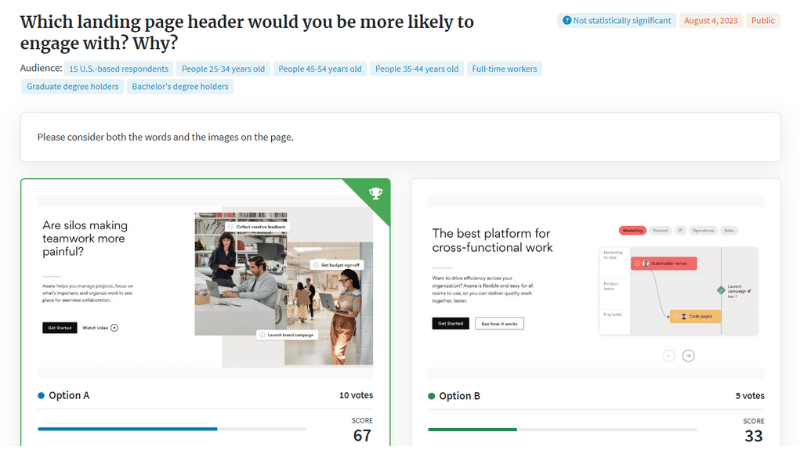
A simple split test to compare whether an opt-in popup form should have a green background or a blue one could be game-changing. A simple color change or a different word choice can dramatically increase conversions – so don’t underestimate testing elements of your site.
Create a Brand Kit and Style Guide
How to keep your website consistent when you work with freelance designers, writers, and in-house teams?
The answer is to document everything in a brand kit and style guide.
A brand kit should consist of:
- Your brand color palette i.e, your main brand color, an accent color, text color, and so on.
- The font family you use for different elements like body text and headings.
- Images. Whether you use custom-made graphics or stock images.
- Logo variations in full color, grayscale, inverted, and so on.
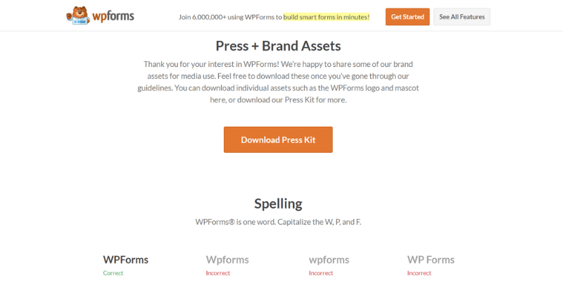
- Correct brand name spelling and usage.
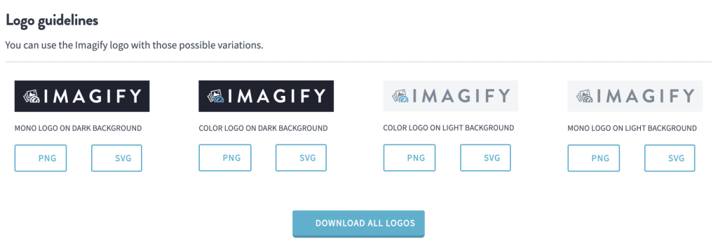
Likewise, a style guide is a very helpful document that ensures parties within and outside your organization stay consistent with content. A style guide can include:
- Rules about how you capitalize subheadings.
- The best way to format blog posts. For example, listicles vs academic styles, etc.
- Whether writers should use UK or USA English.
- Tone of voice when writing sales pages, blog posts, technical articles, and more.
- Guidelines for images in blog content. For example, the maximum width for a screenshot.
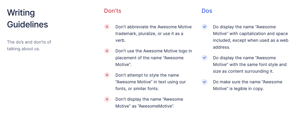
These are a few ideas for building your brand kit and style guide. The idea is to document important elements and make them available so your web copy and site appearance are consistent no matter who is working on them.
By incorporating these strategies into your web design process, you can create a website that is visually appealing but also user-friendly, accessible, and effective at driving conversions.
Wrapping Up
Do you want to achieve your business goals? Seeing your sales go up and serving more customers?
Then, you need to take website design seriously to meet your goals. We’ve laid out several critical design mistakes that could be losing you hundreds of customers, and you might not even know it.
Remember to keep things consistent and to put your user foremost in mind during the design journey.
By improving your website performance and design, you’ll also succeed in your business and make customers happy. Get designing!


