Looking for an efficient way to convert your images to WebP and…
Do you want to know the right image sizes for your website? In this article, we explain why using properly sized images is important and what are the best dimensions for your WordPress site (including on mobile). You’ll also get a bonus showing how a plugin like Imagify can help you in your image optimization journey.
Let’s dive in.
Why Choosing The Right Image Size Is Important
Having images on your website that fit all screen sizes is essential for creating eye-catchy pages and ranking well in search engine results. However, the size of your images matters: if they are too large, it may impact your site’s performance; if they are too tiny, you risk creating a bad user experience.
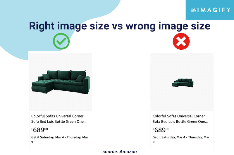
What Does Image Size Mean?
The term image size refers to the height and width of an image measured in pixels.
A pixel, or picture element, is a single point in an image made up of a set of points. The number of points present in the image determines its definition or clarity.
| 📖Glossary: Image size: the physical size and resolution of an image measured in pixels (e.g.: 800x600px). File size: the amount of space (in bytes) taken by an image on a memory card or your computer. Image quality: how much compression is used to store the file information. Image resolution: the number of pixels per unit of length in an image measured in pixels per inch (ppi). |
Benefits of Choosing the Best Image Size
Having the best image size improves performance, makes you rank better on Google, boosts the user experience, and ultimately increases your conversions. Let’s go over each of the benefits:
1. Optimize Performance
Lighthouse recommends properly size images to improve your website’s loading times on desktop and mobile. Serving optimized images on mobile will save cellular data and boost page speed.

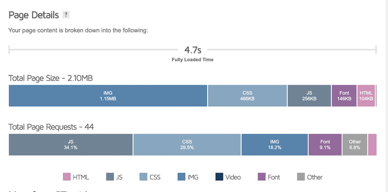
That is why you should opt for an image size that won’t affect your page weight too much. In our example below, images constitute 18% of the total page request, and half of the page size is occupied by images! With some optimization, you could easily reduce the space taken by images and improve your loading time.
| Read more about optimizing your images to pass the PageSpeed Insights audit. |
2. Improve SEO Visibility & Traffic
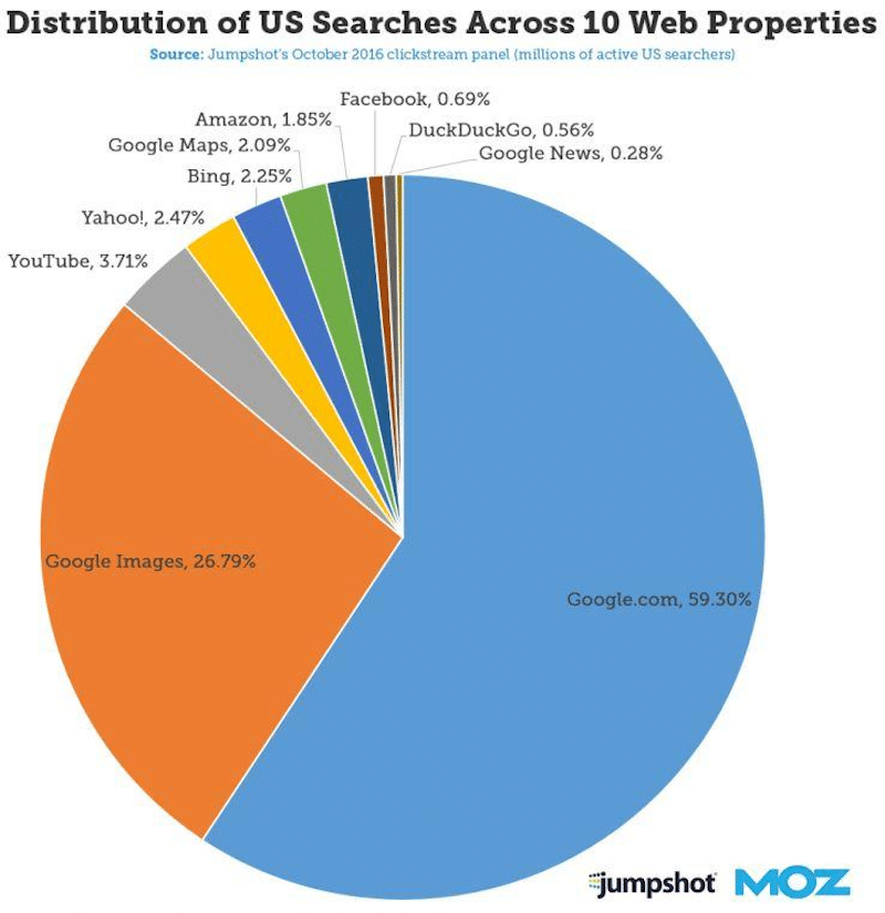
Images need to be optimized and served at the right size to improve your ranking on search engines (especially on images)results. According to Moz, almost 27% of searches in the US are made through Google images:
Google penalizes slow websites, so if you want to make it in the top results, you need to have image file sizes as small as possible (without impacting too much the quality).
3. Enhance User Experience
Images should not be larger than your page layout on mobile, tablet, and desktop if you want to offer a great user experience on multi-devices. The browser will resize the image to fit its container, but it still has to download the full HD file from the server. If the image is not sized properly, it will take up bandwidth and increase the loading time, resulting in a poor user experience.
4. Increase Conversions
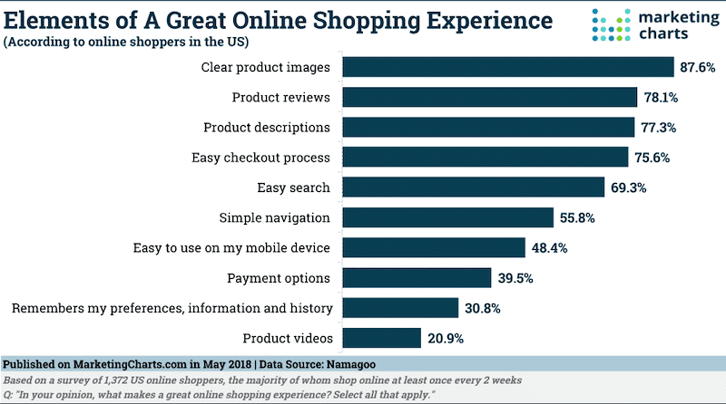
Conversions are directly correlated with page speed and user experience. As an online shopper yourself, you may leave or even not trust a slow website with blurred images. On the contrary, 87.6% of shoppers are more likely to buy on a website with clear pictures, meaning with a good size without compromising on the quality.
What Are The Best Image Sizes For Your Site?
Images should be sized to fill the container based on the layout of your website. In that section, we will give you some best practices to follow to serve the best image size for each part of your site.
Mobile Site and Apps
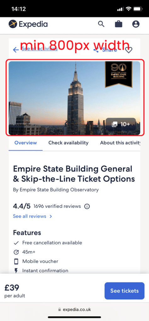
Dimensions: Minimum 800px
Aspect Ratio: 4:3
Pixel resolution: 72 ppi
Tips: You can go to 1200×630 pixels, but after that, some impact on the performance may be noticeable for your mobile users. Additionally, the best ratio for mobile devices banner images are 1:9, 1:1, 1:1, or 4:5. Knowing those ratios can be helpful when running ads.
WordPress Blogs
WordPress blogging generally has two types of images: the blog post and the featured image.
- Blog post images
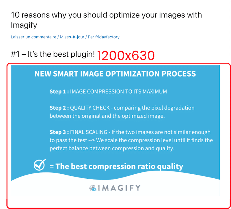
Dimensions: 1200×630 pixels
Aspect ratio: 3:2
Pixel resolution: 72 ppi
Tips: Prioritize what is most important in your blog post: the textual content or the images. If you are writing about a destination, the photos will be important; in that case, keep this dimension. If you are writing a financial article with a few figures, then an 800-width image may be enough.
WordPress Featured Images
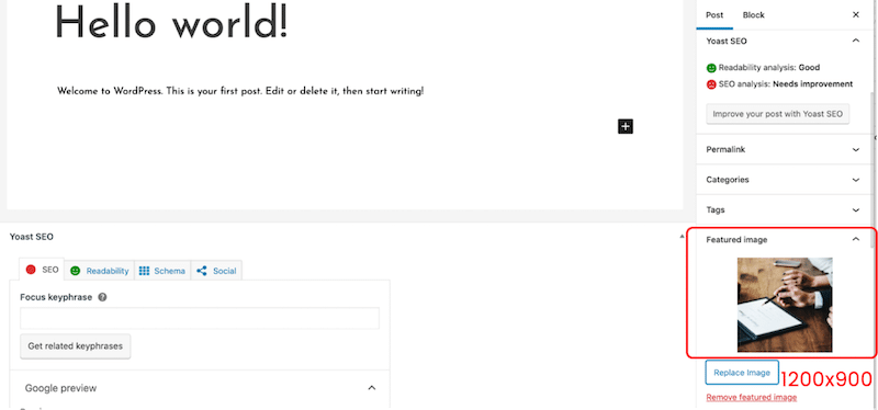
Dimensions: 1200×900 pixels (landscape) or 900×1200 pixels (portrait)
Aspect ratio: 3:2
Pixel resolution: 72 ppi
Tips: If the blog page listing all the posts has a custom featured image size (e.g: square), you should resize images accordingly.
WordPress Sliders
Sliders allow you to display several images on a page and to go from one to the other using controls (e.g., arrows).
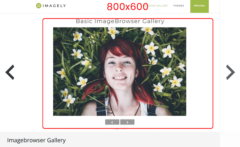
Dimensions: 800×600 pixels
Aspect ratio: 3:2
Pixel resolution: 72 ppi
Tips: 640×480 is also recommended to ensure visibility on smaller screen resolutions.
WooCommerce Products Images
WooCommerce has a few image sizes defining the actual image dimensions for a single product, the gallery thumbnail, and the thumbnail.
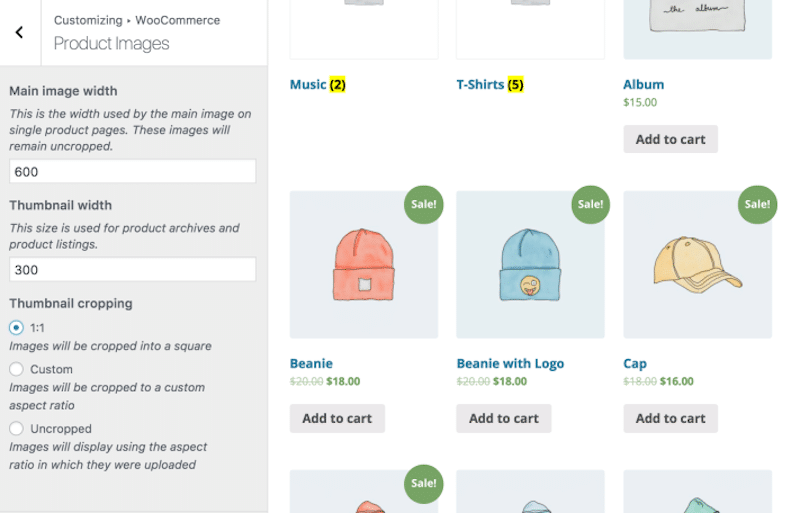
Dimensions: For a single product, WooCommerce recommends a 600px width. For the WooCommerce gallery, 100x100px, and the thumbnail, 300px.
Aspect ratio: 1.1
Pixel resolution: 72 ppi
Tips: For optimal quality, you can aim for 1500x1500px but no more as it may start impacting performance.
Regarding the aspect ratio, you can set the settings to “Uncropped” to ensure that the image fits in the visual container when uploading it.
| 💡Pro Tip: We’ve put together 12 best practices you can use for your product images. |
Lightbox Images
A lightbox is a highly customizable image or video that lets you catch the visitor’s attention without slowing down your site or opening another window.
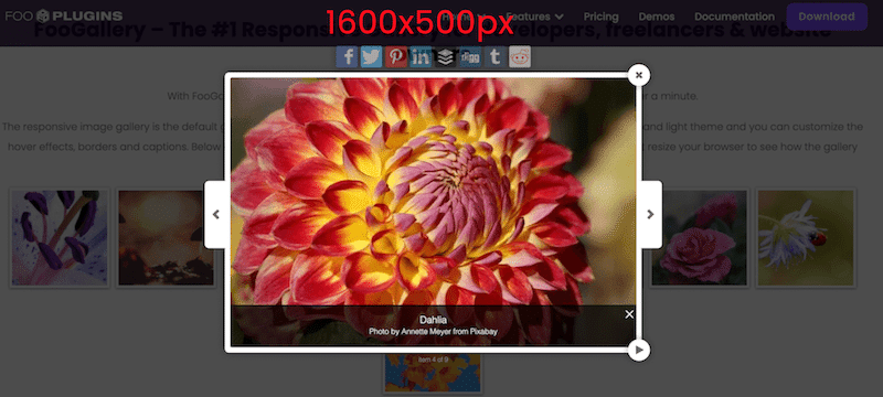
Dimensions: 1600x500px>
Aspect ratio: 16:9
Pixel resolution: 72 ppi
Tips: You can go above 1600px if you want to showcase some high-quality images.
Website Background
A website background can be the heart of your design strategy, just like this museum did in our example below:
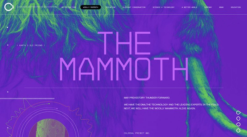
Dimensions: 920x1080px
Aspect ratio: 16:9
Pixel resolution: 72 ppi
Tips: Use a background only if it’s part of your brand identity, don’t use one “just to use one”, as it’s more MB added to the page weight.
Website Hero and Header Image
A hero image is a large banner at the top of your website. It’s called a hero image because it’s usually the first thing users see when they visit your site.
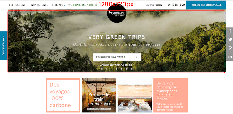
Dimensions: 1280x720px
Aspect ratio: 16:9
Pixel resolution: 72 ppi
Tips: Stand out from your competitor and take the time to find the right image with the right feeling you want to communicate through your design. Do you want something bold with bright colors? If your business is a spa, we recommend using relaxed colors instead.
Website Logo
Usually, your website logo can be either a square or a rectangle.
Dimensions: 100x100px (square) and 250×100 (rectangle)
Aspect ratio: 1:1 and 2:3
Pixel resolution: 72 ppi
Tips: If your logo has a transparent background, we recommend you use the SVG, PNG, or WebP format.
Website Banner
Banners are commonly used for advertising on websites. The most popular banner images are square but also in vertical, portrait, and leaderboard formats. In the figure below, you can see the common banner that we find on the web:
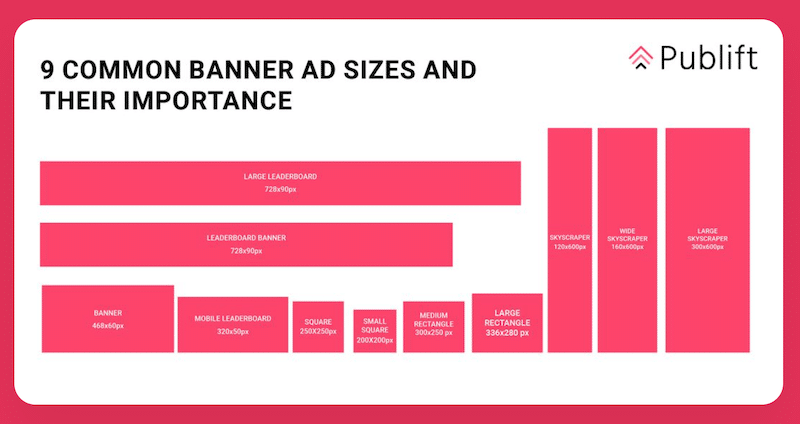
Dimensions: 250×250 (square); 468×60 (banner rectangle); 120×600 (skyscraper)
Aspect ratio: 1:1 if it’s a square – Depends on the banner
Pixel resolution: 72 ppi
Tips: Ad size affects your ad’s visibility and its ability to convey a message. For example, we don’t recommend you use 160x600px ads if you have a long message to write.
Website Slideshow
A slideshow is a web element aiming to showcase images like a gallery.
Your images should match the slideshow player’s display size, which is usually a maximum of 2500 px.

Dimensions: 1024 px to 2500 px in width
Aspect ratio: 3:1
Pixel resolution: 72 ppi
Tips: For an optimal user experience, crop the images that don’t fit in the slider container.
Comparison Table
A comparison table supports users when they need to decide. It shows multiple attributes of similar products.
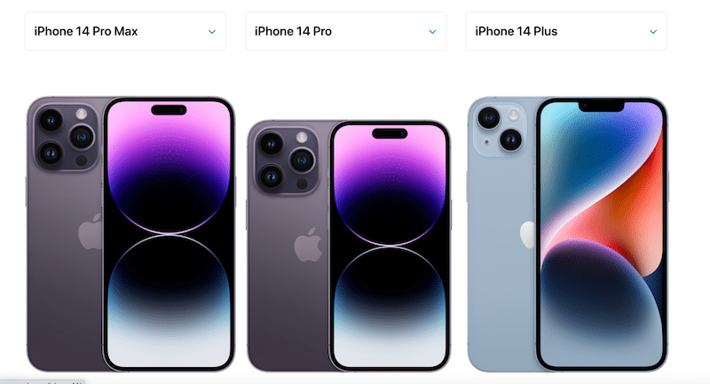
Dimensions: 250 px width min
Aspect ratio: 5:2 (in our example)
Pixel resolution: 72 ppi
Tips: It depends on the number of products you want to allow your visitors to compare at the same time.
Now that you know the best image sizes for your website, let’s see how Imagify can help optimize all of the images mentioned above.
How Imagify Can Help Resizing Your Images
Imagify is one of the best image optimization WordPress plugins that allows you to properly compress and resize your images for the web. (Bonus: It also converts them to WebP and Avif). With Imagify, you can choose between optimizing the photos one by one or using the bulk compression option:
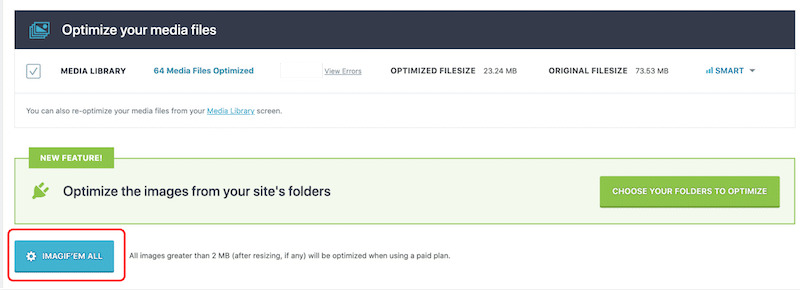
Let’s look at how Imagify can help you resize your images easily from the WordPress dashboard.
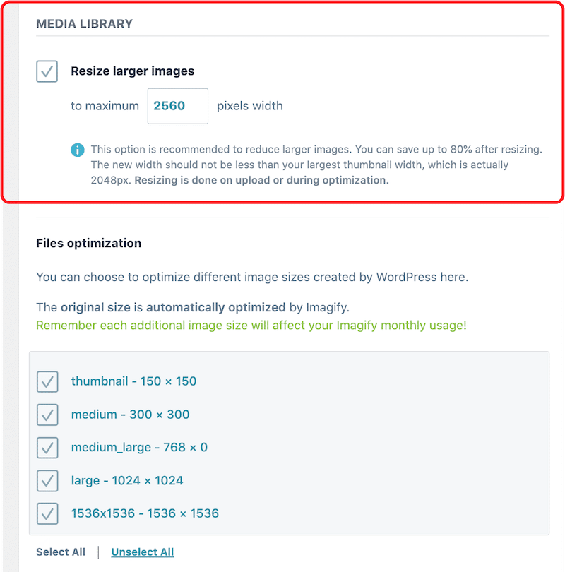
You can use Imagify to restrict maximum image sizes. Resizing can be done on upload or during optimization, as shown below:

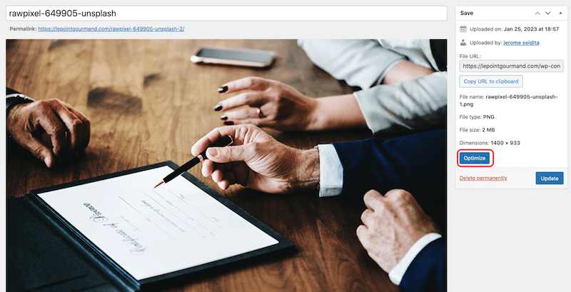
Let’s take an example with a PNG image weighing around 2MB and measuring 1400×933 px. I will optimize it with Imagify and share the impact on my image size at the end of the test.
Step 1 – Go to the WordPress library and open the image to optimize:
Step 2 – Click on the “Optimize” button:
Note: you could also use the bulk feature of Imagify to resize and optimize images in one click.
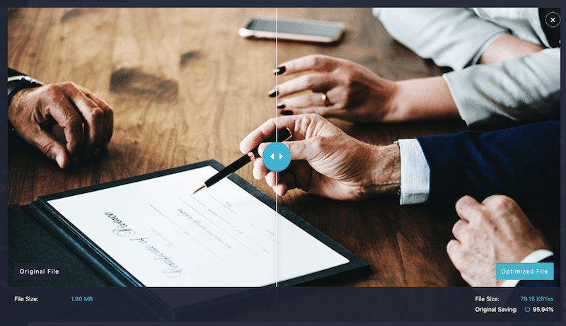
Step 3 – Check the new file size optimized by Imagify:
Imagify saved 95,94% of the file size, shrinking my image from 1.90MB to 79.15 KB!

The image quality has not been impacted after resizing and compressing my file with Imagify. We have the best of both worlds: an optimized smaller image but served in high quality to users.
Wrapping Up
Serving the proper image size on the web according to each part of your website is important for performance and SEO. You can’t have the same image size for a logo and a hero banner. It’s recommended to have different formats for each. When you have chosen the most suitable size, use a plugin like Imagify to upload smaller files to WordPress and optimize your media even more without compromising on quality. The plugin is free for up to 20MB per month, around 200 images. Meanwhile, you can try Imagify for free and see how much you save on your image size.


