Looking for an efficient way to convert your images to WebP and…
Want to know why and how you should make responsive images that match all types of screens? In this article, we’ll go over the concept of responsive images for each device, how to make an image responsive, and share a few more image optimization techniques to boost performance.
What Are Responsive Images and Why They’re Important
Responsive images mean your browser knows which image to load based on the user’s device, screen size, orientation, and network.
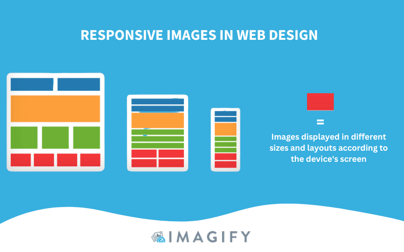
You need responsive images to serve a fast web page to your users across all devices (mobile, tablet, and desktop). If you don’t make your images responsive, the same image size will be served to someone using a large-resolution computer or a smartphone. This lack of adaptability toward the user and the network will have a negative impact on performance.
Impact of Responsive Images on Performance
By optimizing large images on mobile and making use of responsive image techniques, you will significantly improve your performance metrics.
Let’s share a few facts about responsive images!
Performance fact #1 – Responsive images improve your page load speed.
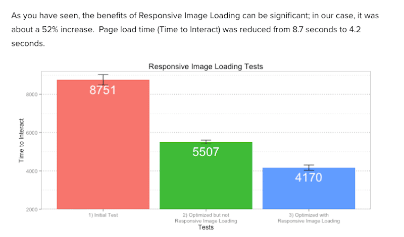
In the example below, we can see the benefits of using responsive images on performance.
When optimizing and serving responsive images, the page loading speed was reduced from 8.7 seconds to 4.2 (a decrease of 52%).
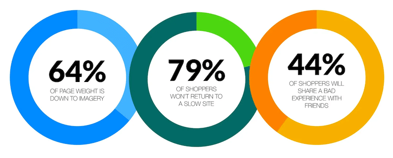
Performance Fact #2 – Images consume 60% bandwidth when loading a web page.
Images are the dominant resource on a web page, which is why you should make sure to serve the right size to the visitors. Almost 80% won’t return to a slow website, and you don’t want this to happen for your business. When optimizing your site for performance, try to include everyone and remember that responsive images are more accessible to users on mobile and slow connections.
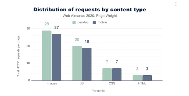
Performance Fact #3 – The number of HTTP requests per page is mainly done by images.
A high-resolution image can generate a very large file size, which drastically affects performance because the browser will be busy for a long time downloading this resource. To avoid a slow browser execution time with many HTTP requests, you should try to serve responsive images, so mobile users don’t have to display a 2400 px wide image.
Performance Fact #4 – Serving responsive images means that you efficiently use your bandwidth.
Lighthouse tells you to properly size images and efficiently encode images to save mobile data and bandwidth and improve the overall load time.
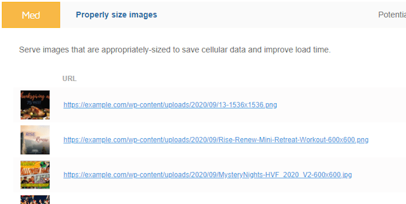
Images are often the main culprit for performance issues. That’s why serving responsive images is crucial for a better cross-device experience. Properly sizing your images according to the user’s device boosts your visitors’ satisfaction as all major performance metrics are also improved. And last but not least, you’ll also lower your bandwidth consumption.
Now that you know why responsive images are important in web design let’s see how to make them responsive. In the next section, you will learn how to create responsive images on the web so that your images load quickly and look great on any device.
How to Make Responsive Images on WordPress
The best way to make responsive images is to use the “src”, “srcset” and “size” attributes.
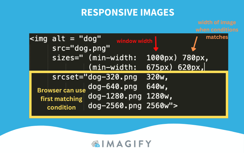
But before we explain how to make an image responsive, let’s go over some basic knowledge about responsive design.
💡HTML has its syntax, elements, and attributes for responsive images that let you serve different images for different viewports, such as:
- The <img> tag – Used to embed an image in a page. Images are not technically inserted into a web page; images are linked to web pages.
- The “src” attribute – Specifies the URL of the media file to display.
- The “srcset” attribute – This attribute describes to the browser how the image should behave. You assign an image width so the browser checks the image that matches the browser width.
- The sizes attribute -Specifies the size the image should scale to select the most efficient image according to the proportion of the screen.
- The <picture> and <source> elements – Dictates what image the browser should use. You can specify different images depending on device characteristics.
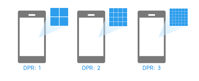
- Device Pixel Ratio (DPR) – Number of pixels on the screen.
Using The “srcset” and “sizes” Attributes To Make Images Responsive
In web design, a basic code to display an image looks like this:
<img src="cute-cat-800w.jpg" alt="a nice cat" />
To make it responsive, you can use two attributes — srcset and sizes — to provide several additional source images along with hints. This will help the browser pick the right one according to the device’s resolution. That’s what the responsive code will look like:

Another example is if you want to tell the browser to serve high-resolution images only to users with large resolution screens (with a Device Pixel Ratio of 2).
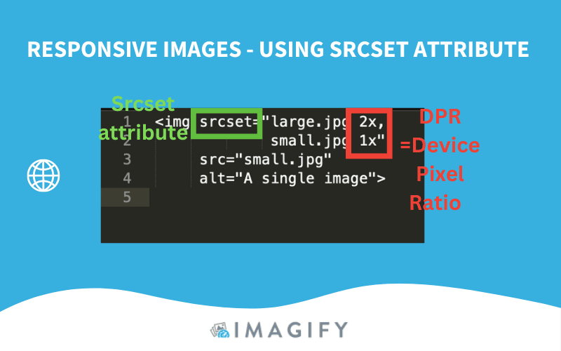
In plain English, my code snippet gives the following instructions to the browser:
- Display large.jpg to visitors with a DPR of 2.
- Display small.jpg to visitors with a DPR of 1.
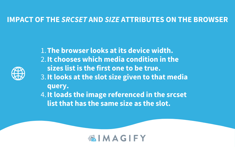
To summarize, this is what happens when the browser fetches both Srcset and Size attributes:
Making Responsive Images on Bootstrap
Bootstrap is a free front-end framework allowing easier web development. Images in Bootstrap are made responsive with the img-fluid class. This applies max-width:100%; and height: auto; to the image so that it scales with the parent width.
<img src=”image.jpg” alt=”Description” class=”img-fluid”>Responsive images of different sizes depending on the screen
If you would like your image to be 100% width on mobile but 500px maximum on desktop, you should use what is known as Media Queries in your CSS.
- For devices smaller than 480px (mobile):
Implement this code snippet:
@media only screen and (max-width: 480px) {
  img {
    width: 100%;
  }
}
- For devices bigger than 992px (desktop):
@media only screen and (min-width: 992px) {
  img {
    width: 500px;
  }
}
Creating Responsive Images With WordPress
When you upload images in the WordPress library, it automatically crops new images to smaller sizes. For example, if you upload an image that’s 1500 x 706, the different image sizes will look like this:
- Full Size – 1500 x 706
- Large – 500 x 235
- Medium – 300 x 141
- Thumbnail – 150 x 150
The good news is that since WordPress 4.4, native responsive images are supported via the “srcset” and “sizes” attributes to the image markup it generates.
The other good news with WordPress is that many plugins in the ecosystem can help you optimize images even more! Making them responsive is a great start for performance, but in the next section, you’ll discover more optimization techniques to implement.
Additional Tips to Optimize Your Images
Using an image optimizer WordPress plugin can benefit any business looking to get a faster website. The following 4 image optimizations techniques also play a critical role in improving the performance of a website:
- Implement Lazy Loading
- Convert Your images to the WebP Format
- Smartly Compress Your Images
- Use a CDN to Distribute Images Efficiently
1. Implement Lazy Loading
The basic idea of lazy loading is to load images only when users need them (above the fold). In our example, we are showcasing LazyLoad by WP Rocket, a free plugin that allows you to implement the lazy loading script on your images:
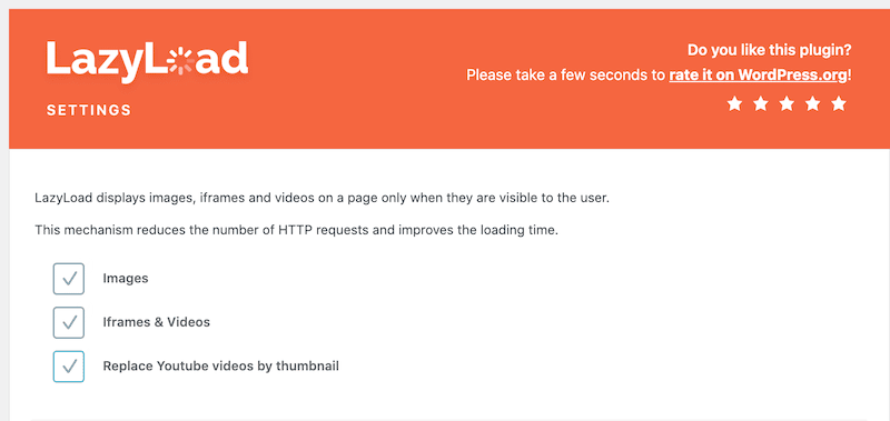
If you want to learn more, here’s a full list of the best WordPress Lazy Loading plugins you can use for your next project.
2. Convert Your Images to WebP
Google estimates that WebP compression results in between 25% and 34% smaller files than a JPG image (and for the same quality). As a result, converting your images to WebP can save you a large amount of KB. The best way to convert your photos is to use an image optimization WordPress plugin like Imagify.
Here’s a straightforward example of Imagify creating WebP versions of images in one click from the WordPress dashboard:
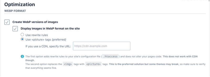
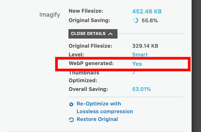
As you can see from the WordPress library, the WebP is automatically generated:
| 🔊 Important to note: as of March 2024, Imagify also converts images to Avif, the other next-gen format recommended by Google to make your images lighter. |
3. Smartly Compress Your Images
Serving responsive images is great, but try to serve responsive and compressed images to your visitors! The impact on performance will be outstanding. The only advice is to choose a compression tool that does not make the image too blurry. You still want to serve an image with good quality that will not affect the user experience.
For instance, Imagify preserves image quality thanks to the Smart Compression feature. No need to worry about which compression level is right for your needs. Imagify does all the heavy lifting.
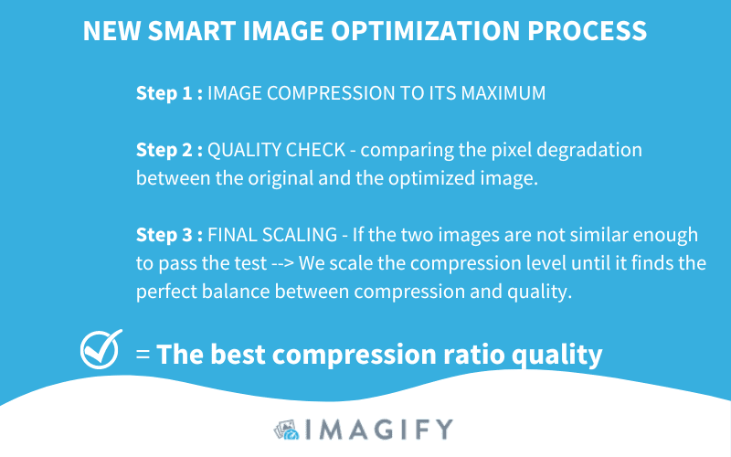
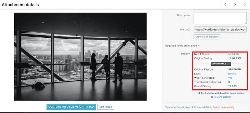
In a real case scenario, Imagify’s smart compression can save up to 90% of the total image size:
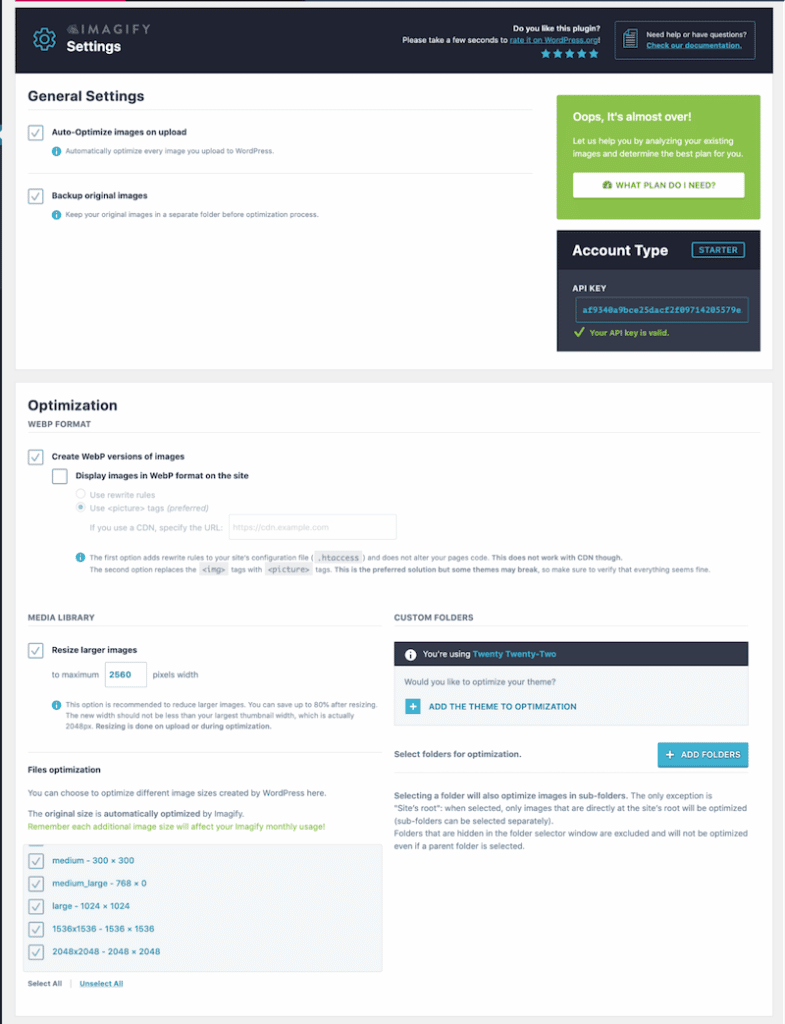
On top of that, Imagify also presents the following optimization features that will give your website an extra speed boost:
- Support many image formats such as PNG, JPG, GIF, PDF, and WebP.
- Optimization and resizing are done automatically on upload or existing images you choose.
- Automatically resize large images to save bandwidth.
- Clean and easy-to-use interface:
4. Use a CDN to Distribute Images Efficiently
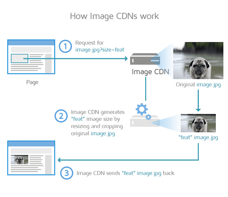
CDNs decrease image payload and instantly send optimized images from the point of presence (PoPs) to the user worldwide. They can resize and crop original images on the fly to display the most suitable size according to the device.
Wrapping Up
Choosing the right image size according to the screen resolution can be crucial in improving a website’s performance. Serving responsive images enhances the user experience across all devices, which is what Google is expecting from a website! You’ll be rewarded with a better ranking and good Core Web Vitals.
In addition to responsive images, remember to use other image optimizer plugins like Imagify or LazyLoad by WP Rocket to optimize your media. Why don’t you give Imagify a try? It’s free for up to 20 MB of images a month, and the only risk you take is to optimize further your responsive images.


