Looking for an efficient way to convert your images to WebP and…
Are you getting the “properly size images” warning when running a performance audit on Google PageSpeed Insights? This issue is triggered if Lighthouse identifies any images on your page that aren’t appropriately sized.
Properly sizing your images can drastically improve page loading times and reduce bandwidth consumption. In this article, we share some optimization techniques you can follow to optimize the images of your WordPress site.
What Does Properly Size Images Mean?
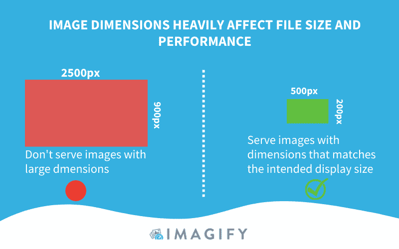
Properly sizing your images means that the image URL should not be larger than the size they are rendered at on the visitor screen. You should not serve anything larger than what’s needed – it would waste bytes and make the page slower.
| The golden rule: Images uploaded on your WordPress site should be sized based on the dimensions they will be displayed. |
What Triggers the Lighthouse Warning
Lighthouse compares the size of the rendered image (device pixel ratio) and the size of the actual image. The “properly size images” warning is triggered if the rendered size is at least 4KiB smaller than the actual size.
Impact Of Improperly-sized Images on Performance
If images are not sized properly, the browser will take the “decision” to resize them before displaying them to the visitor, wasting time and resources. Too large images harm the page experience, forcing the user to download more data than needed.
| A high-resolution image = huge file size = drastically affects web performance = more consumed cellular data |
This is what happens on the browser side when it parses not properly sized images:
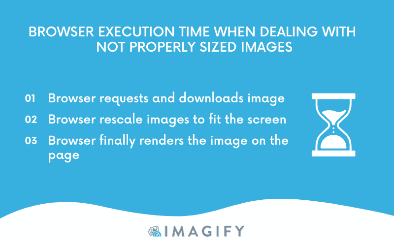
The browser will spend more time downloading the file and resizing the image, increasing the bandwidth consumed. To avoid any performance issues related to images, there are a few easy techniques you can implement. Let’s go over them in the next part!
3 Tips to Properly Size Images on WordPress
To properly size images on WordPress, you can follow three easy image optimization tips:
Let’s dive in!
1. Resize Images to Correct Dimension
Properly Size Images With Software and Online Tools
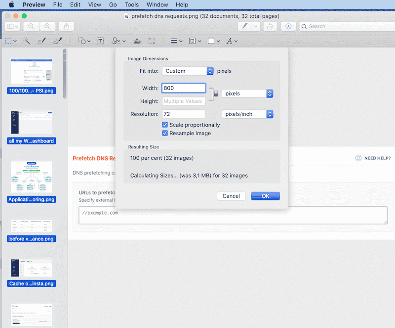
There are many free and premium software you can use to resize images to the correct dimensions. We are sharing two free options on Mac and Windows:
- Preview (Free on Mac)
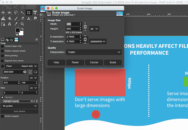
- GIMP – a free editing software allowing you to edit and resize images in a very convenient way:
Of course, you also have the option to use the two famous Photoshop and Lightroom software, but they can be a steep learning curve. We have listed 10 alternatives to Photoshop for image optimization if you are interested.
Important: If you are resizing several images, you may find it more convenient to use a script like Imagemagick to automate the process.
Properly Size Images Using an Image CDN
Image CDNs can help to properly size images for your WordPress site. They specialize in the transformation, optimization, and delivery of images. They are like APIs that access and sort the images used on your site according to the user device.
How does it work?
Each image loaded from an image CDN has an URL that indicates which image to load, plus the size, format, and quality. Then it can “transform” the image to serve it in the best-optimized format.

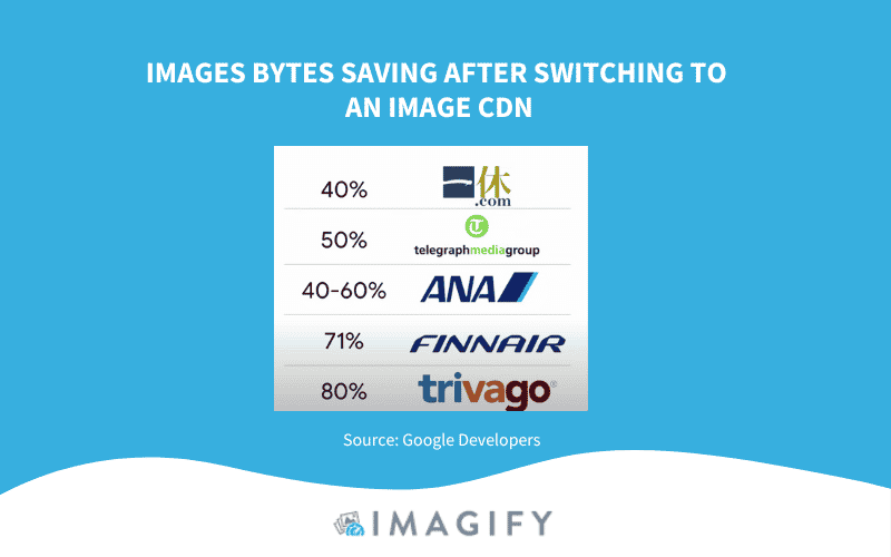
An image CDN also creates variations of an image for different use cases and reduces the image bytes consumption by at least 40%. Google Developers did interesting research about companies that decided to switch to an image CDN. This is how much data they saved:
2. Use Responsive Images
One of the best strategies for serving optimized images is called “responsive images”, meaning adjusting the width and height to fit any screen (mobile, tablet, or desktop). All the images will be optimized and served to the right screen, resulting in less bandwidth consumed and a faster browser execution.
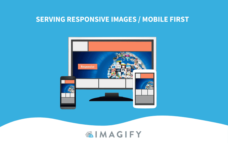
You’ll need to generate multiple versions of each image and then specify which one to use in your HTML or CSS using viewport dimensions, media queries, etc.
Important: the image size will change depending on the site’s layout breakpoints (building blocks of responsive design).
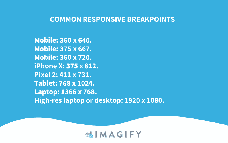
If you want to follow Bootstrap standards, you can use use the following media queries to ensure that your images are responsive:
- 576px for portrait phones
- 768px for tablets
- 992px for laptops
- 1200px for large devices
Now that we know the dimensions we should specify for each screen, how do we tell the browser which one to pick according to the visitor screen?
You can use src, srcset, and sizes attributes to serve different images to different display densities (qualities) on mobile or desktop. In the example below, we use the src attribute to tell the browser that different sizes are available for the flower picture:

To automatically serve responsive images on your WordPress site, you can use Cloudinary (no setup required). It’s an end-to-end image and video management solution for websites and mobile apps. You can easily upload images and videos to the cloud and automate smart manipulations of those media (resigning, optimizations, etc.) without installing other editing software.
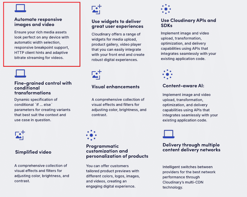
Once optimized, Cloudinary serves the images through those three CDNs: Akamai, Fastly, and CloudFront. If you want to connect your own CDN, you’ll need to contact them.
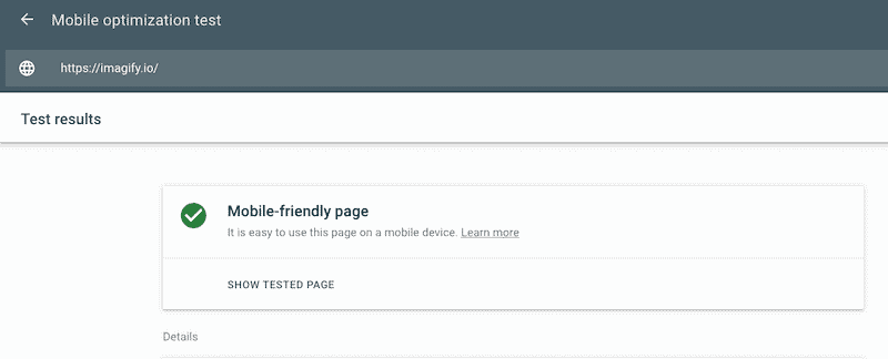
Want to test if your site uses a responsive design? Go to Google Search Console > Mobile Friendly and enter your URL.
3. Use Vector-based Image Formats
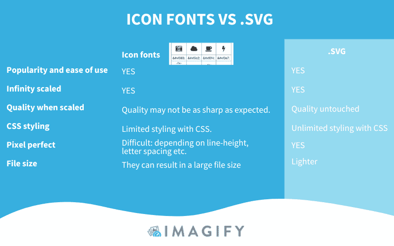
Another strategy to properly resize your images is to use vector-based image formats (like SVG). An SVG image can be infinitely scaled with a finite amount of code without losing quality.
Resizing images is crucial for web performance, but you can follow many other advanced optimization techniques to give your website an extra speed boost.
Have you heard about encoding, compression, and using next-gen formats to make your WordPress site faster? In the next part, we go over a few more image optimization strategies you can implement in a few clicks, thanks to Imagify, one of the best image compression plugins for WordPress.
Making Images Faster with Imagify
With Imagify, you can’t resize your images manually. Still, you can accomplish the following file size optimizations:
| Learn more about the differences between lossless and lossy image compression in our dedicated guide. |
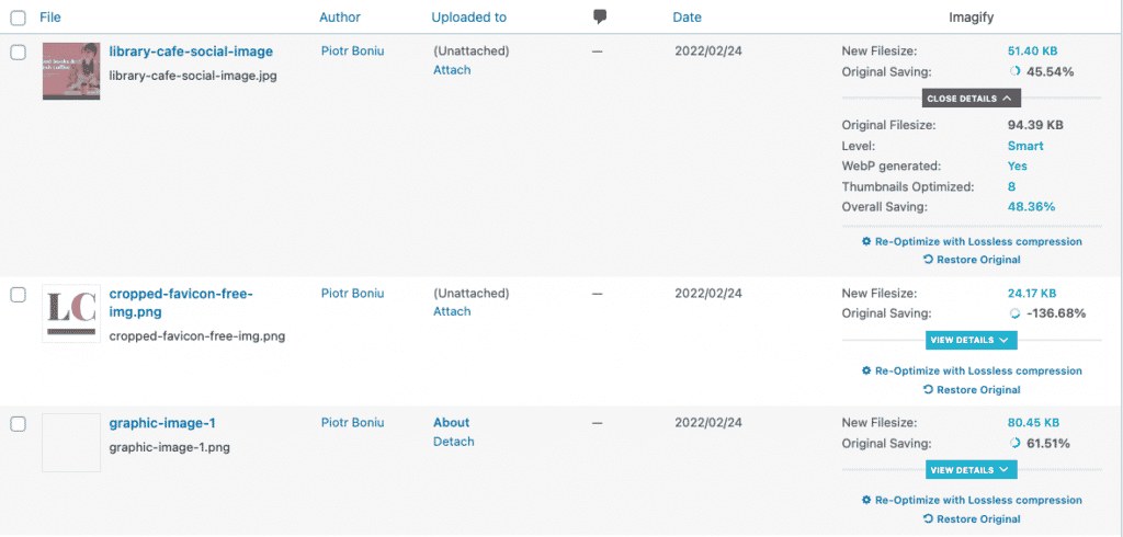
In terms of compression, Imagify can save up to 95% of your file size! In the example below, we can’t resize images with our values, but compression has downsized the width and height of our images.
As mentioned above, bulk optimization allows you to optimize all the images at once:
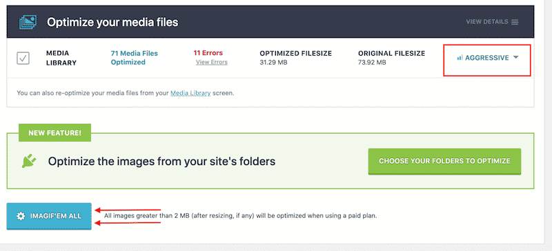
- Convert them to WebP, the next-gen format recommended by Lighthouse.

| 🔊 Important to note: as of March 2024, Imagify also converts images to Avif, the other next-gen format recommended by Google to make your images lighter. |
Wrapping Up
The best way to avoid properly sized image warnings is to learn the measurement of the different areas of your website (logo, sidebar, sliders, featured images, etc.). Once you know which dimensions are needed for each part, displaying the right size for any device will be a piece of cake!
Resizing images is not the only way to optimize them. You also need to compress (or encode) them and serve them in a next-gen format like WebP or Avif.
All those strategies will significantly reduce the image file size, resulting in a faster download time for your visitors. And good news, they can be implemented easily with the Imagify plugin! A free trial is available so you can optimize a few images and see how your page performance improves. No risks-taken!


